You got your Butter in my Coffee!!!
One of my best friends and media cohorts, John Osteen, (no,
not the preacher, quite the opposite actually) was clamoring about the virtues
of something called bullet proof coffee.
John is a motion picture director and motion graphic artist par excellence,
so I tend to listen to him when he finds something new to jump start one’s
creativity. When he detailed the ingredients,
I became understandably skeptical.
You see, this brain-boosting bullet dodging swill contains Butter.
I know, right?
I’m being sensational; forgive me. I dig stirring the pot to generate Internet buzz. I’m a digital whore in that regard. You’re not dumping a scoop of Parkay margarine into your sippy cup full of Folgers crystals, no, no, no, kids, this cranial concoction is going to require a trip to Whole Foods, Trader Joe’s, or a similar type of Douchery-store. You’ll need grass-fed unsalted butter; Kerry-gold works well, Coconut Oil, and some good black coffee. This drink has become popularized by some relentlessly self-improving Bio-Hacker named Dave Asprey, who upon climbing a mountain in Tibet, (presumably not in search of the Ajanti Dagger) was reportedly rejuvenated by a cup of Yak Butter Tea.
Mmmmm, Yak Butter…
Here is Asprey’s site with details of his adventure and how
you can buy his ingredients.
What you do is brew the hell out of a cuppa joe and blend in
the oil and butter with a good high speed blender. I’m leaving out a few details that you can get from Asprey’s
site, like the specific coffee that he recommends to reduce toxins, distilled
water to begin with, and a special oil that replaces the Coconut Oil. That's a little too involved for me. Homeboy is trying to sell his products
and they might just make a difference but I proceeded with over the counter
goodies. In a nutshell, you are
adding fats and medium chain triglycerides with caffeine to sort of kick start
your metabolism and cognitive processes.
There is science to back this idea up, but hell if I’m gonna go looking
for it. Google that shit! I used to take MCTs in high school when
I was big into bench pressing.
Adding supplements to coffee seemed like it was worth a try. The result is a frothy cup of decent
coffee that doesn’t taste bad at all.
It’s a process; it takes a little time and makes for more washing up
afterwards. I’ve had four cups so
far over the past two days and I can report that for me, my appetite was
lessened and mental clarity seemed a bit better. Its like you don’t crash from the coffee so fast. I’ve had a cup after a 5K run and
didn’t feel hungry for two hours, and another after an upper body workout and
felt sharp and not hungry for the same duration. I’ve been working my way up to the full ingredients, which
call for two tablespoons of butter per cup. I am only using one per cup now. It’s counterintuitive to me to add butter to coffee in the
first place, two tablespoons seems drooling loony crazy. Give me time to adjust…

I think this kind of coffee has some merit, but is it healthy? There is
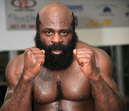
another health guru named Dr. Weil, you know the cat that looks like a white
Kimbo Slice, yeah that dude. He
doesn’t seem to be against it, check out his comments here.
I’m gonna stick with it for a while and see if I get smarter. I need all the help I can get.
Kimbo!!!
Weil

Separated at birth, I reckon. Have a good day, kids.


